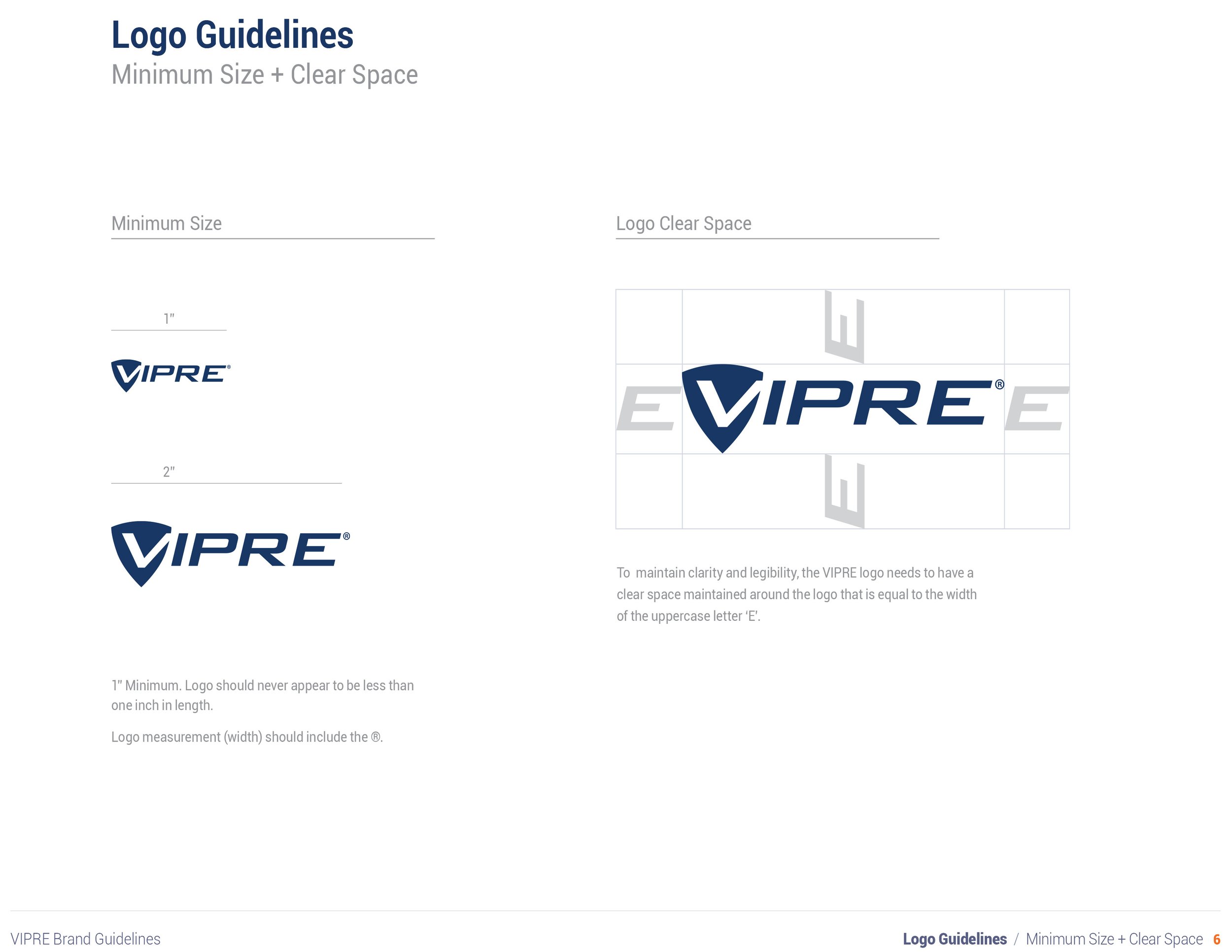
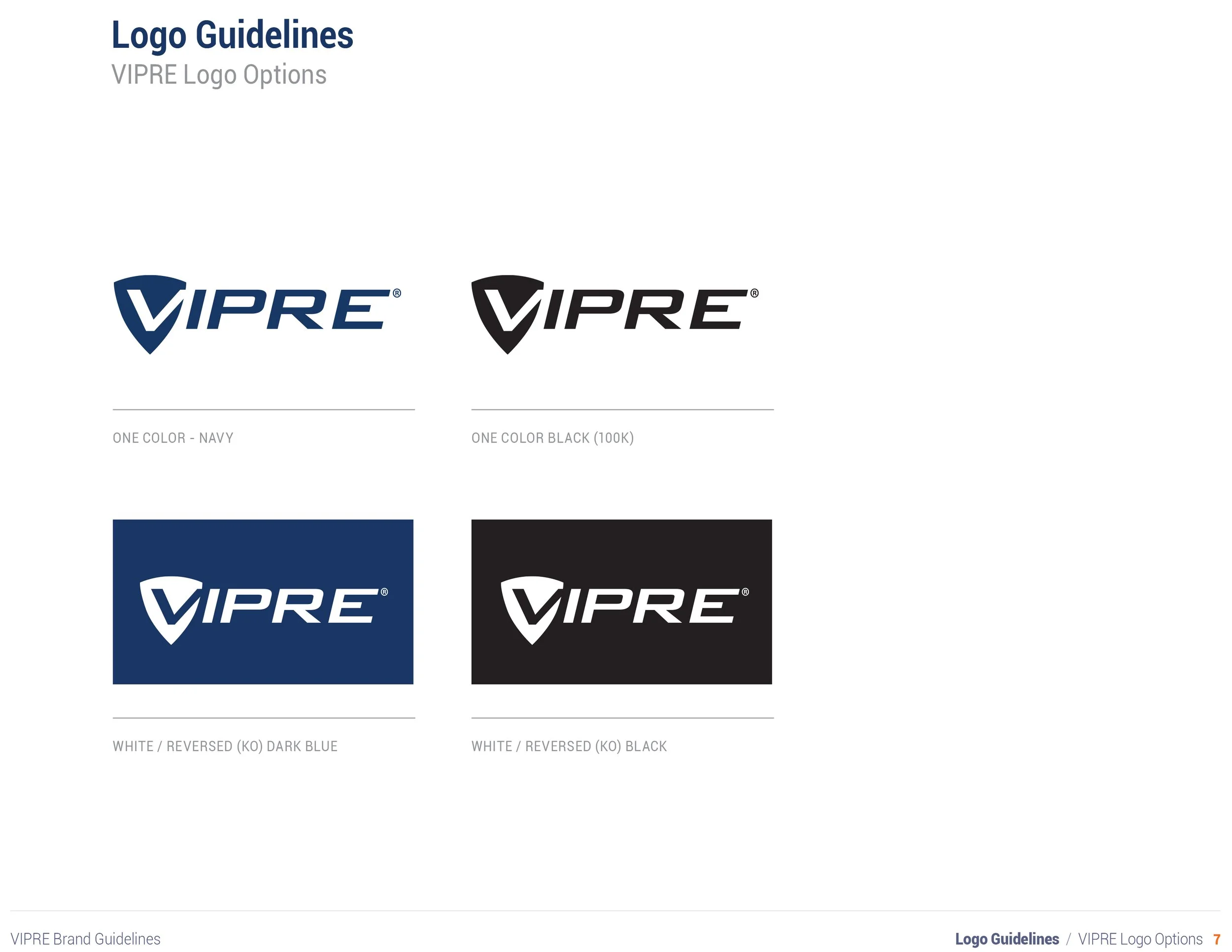
Logo & Branding
I studied Visual Communication at the Fashion Institute of Design and Merchandising (FIDM) in Los Angeles, CA and later received my degree in Graphic Design from the International Academy of Design and Technology (IADT) in Tampa, FL. I have created and managed brands for over 15 years and have been recognized for my logo design skills by NESCHO, receiving their Lamplighter Award of Excellence.


VIPRE Security Rebrand
Objective: Redesign the brand and supporting materials to better align with the target demographic and mitigate legal risks due to the previous logo using stolen clip art.
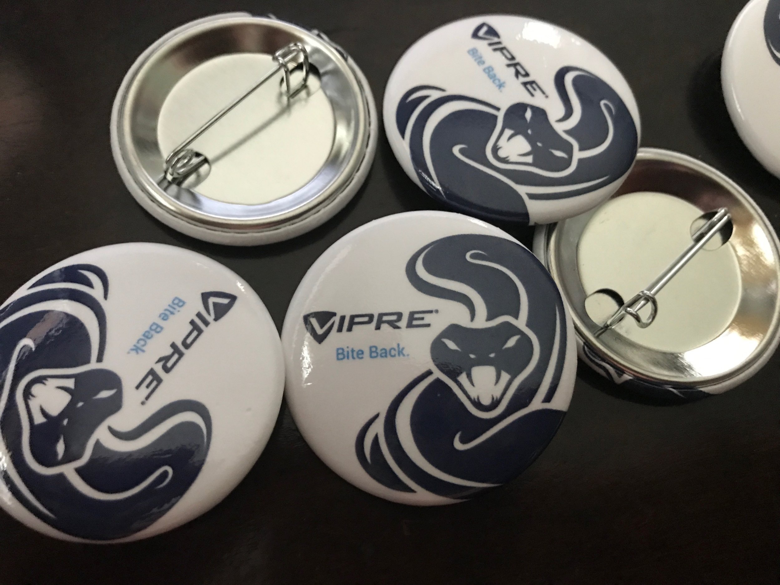
Summary: It was previously assumed that VIPRE’s primary target in the consumer space was men, so the product packaging was very masculine and sterile. But after viewing market research, we found that a large percentage of women were actually responsible for choosing which antivirus software would protect their family’s home offices. We also found that many consumers had a love/hate relationship with the snake and felt it looked dated. It was also unlicensed clip art. With this data, we felt a redesign was in order. Given our new target demographics, I felt a cleaner, more modern approach, while still keeping the integrity of the original logo and communicating security and protection, would better resonate with all of our markets, including consumer, channel and business.
** Below, original logo (left) and redesigned logo (right).
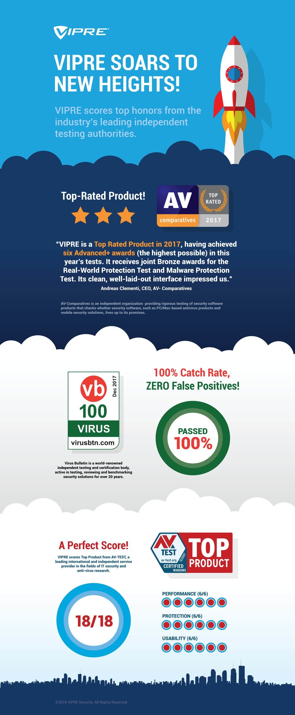
Once I completed the logo redesign, it was time to rebrand all of VIPRE’s marketing materials. I ordered all new signage, redesigned and rebranded all sales and data sheets, trade show materials, business cards and identity materials, product packaging, info graphics, websites, billboards, display ads, and internal systems.
Brand Management
Digital Illustration
Typography
Graphic Design
Print Design and Page Layout
Logo Design
Large Format Design
Digital Advertising


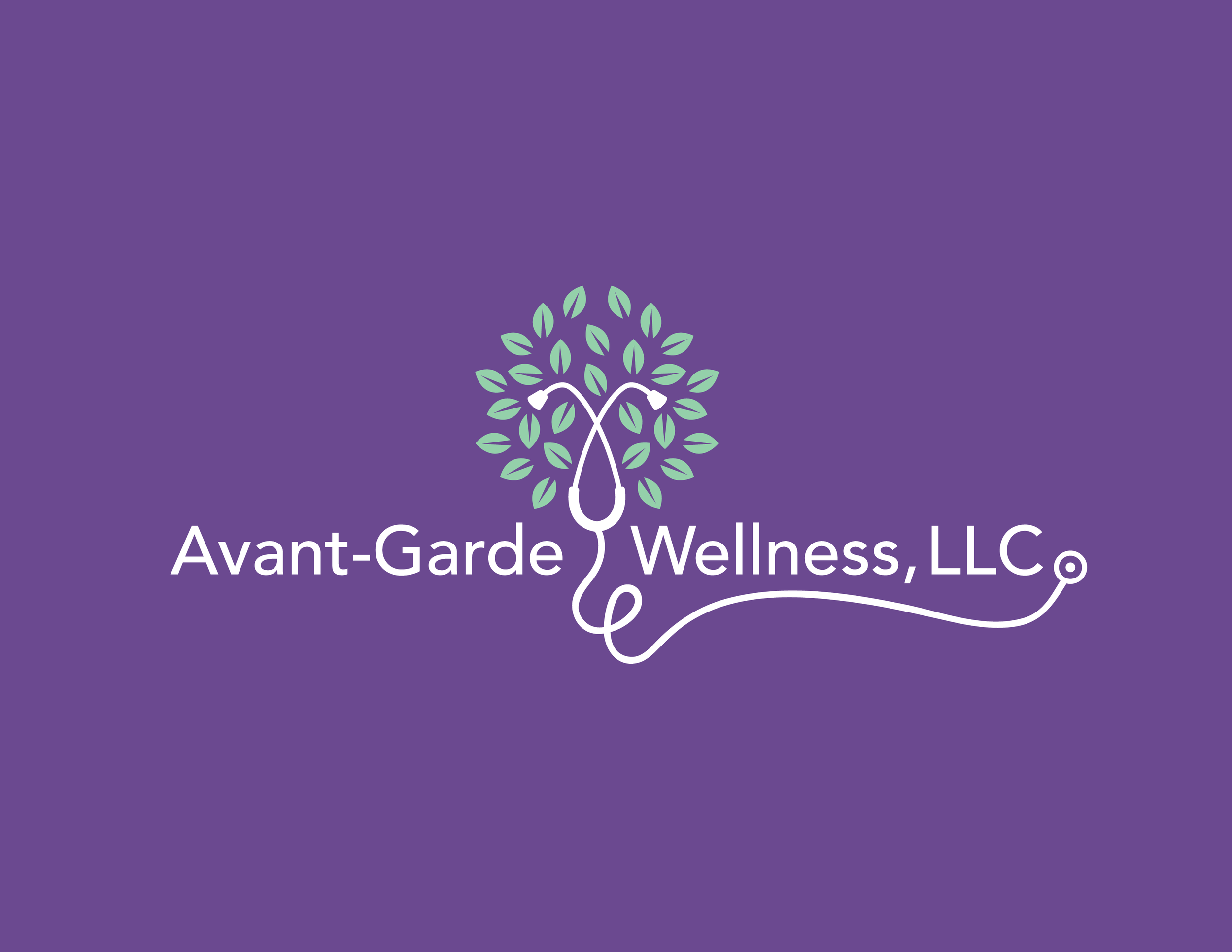
Avant-Garde Wellness Logo Redesign & Identity Package
Objective: Redesign the brand and supporting elements to look more professional and offer a clear and friendly approach to healthcare.
Summary: The owner was unhappy with her logo and brand materials. Together, we re-designed her logo to have a fresh and friendly look that communicates health and wellness. I then used the updated logo to redesign her business cards, services brochure, and her company website.
Software: Adobe Illustrator • Adobe Photoshop • Adobe InDesign
Logo Design
Corporate Identity
Print Design
Branding
Web Design


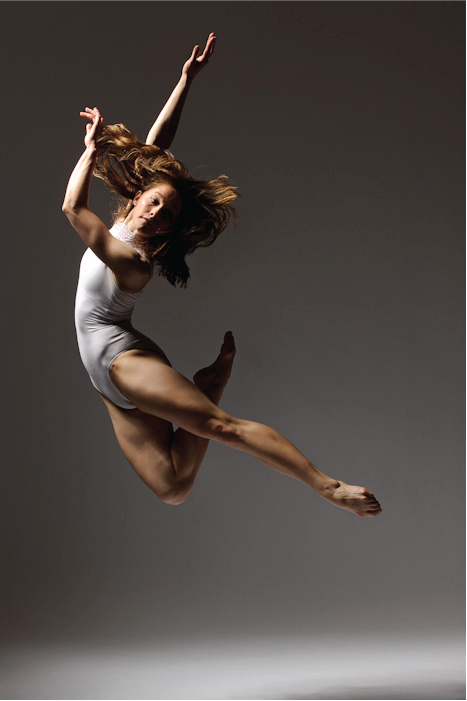
Gulfcoast Dancenter Show Logo
Objective: Create a logo that communicated the theme of a new show, Kinetic: Energy by virtue of being in motion. The logo would be the centerpiece of all promotional materials and advertising.
Summary: The studio owner approached me and asked me to help her create a brand for a new show she was premiering. The shows focus was bodies in motion. She shared imagery of dancers in positions that she felt represented kinetic energy. After viewing several I came across one in particular that caught my attention. The dancer was actually forming the letter K with her body. That sparked an idea and got my creative juices flowing. I used the photo to create an illustration of the dancer that became the K in the Kinetic logo. I used a fluid, brush-like font that seemed to move with the dancer for the remaining letters.
Software: Adobe Illustrator
Digital Illustration
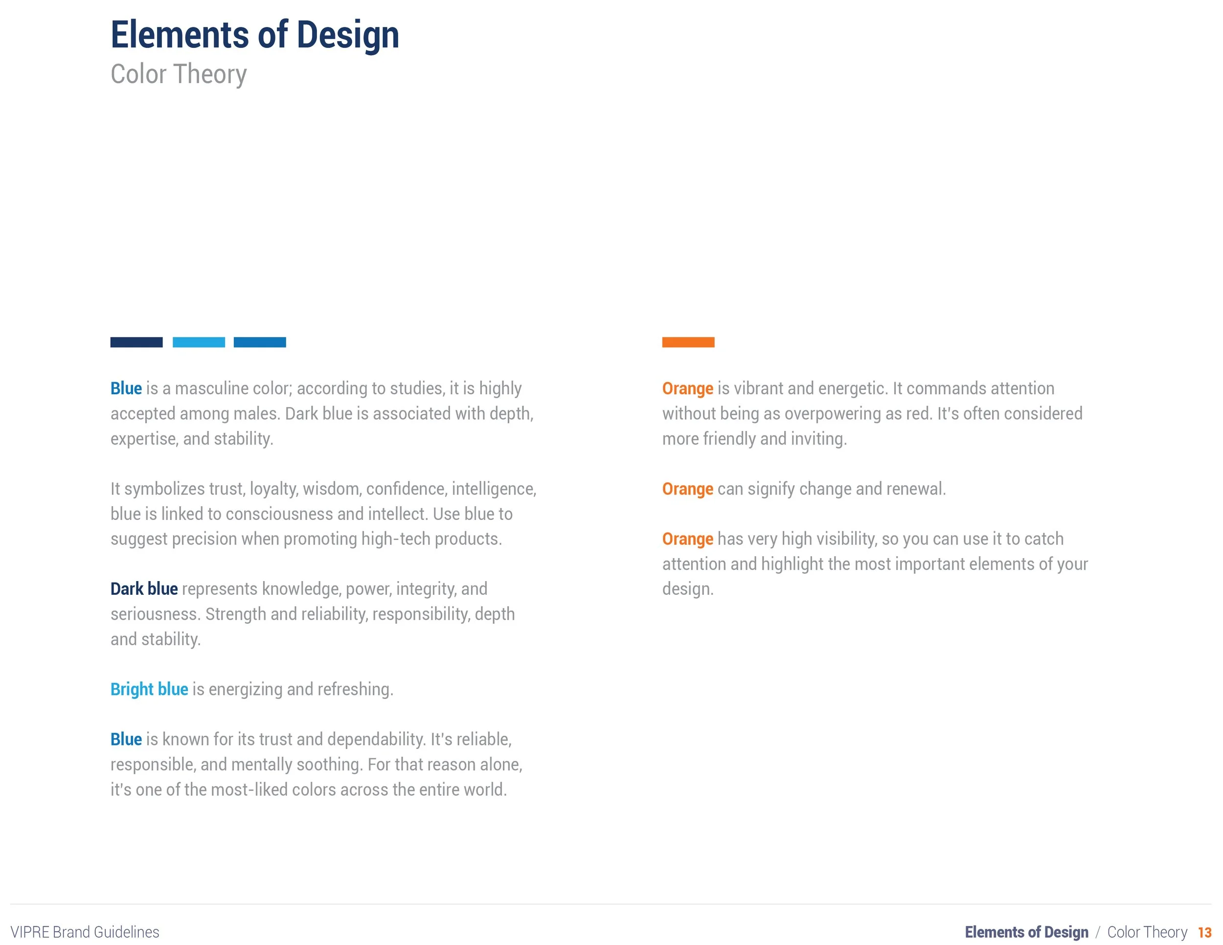
Color Theory
Typography